
Less Struggle, More Booking: Ryan Air
Duration:
1 Week
Client:
Ironhack Bootcamp
Year:
2024
Goal:
Improving accessibility
about.
During the second week of the Ironhack Bootcamp, our task was to redesign an existing app with poor accessibility. I chose Ryanair, a widely-used budget airline app that, despite its popularity, poses several usability and accessibility challenges. This project focuses on creating a more inclusive and intuitive experience, while preserving the excitement of affordable travel.

problem.
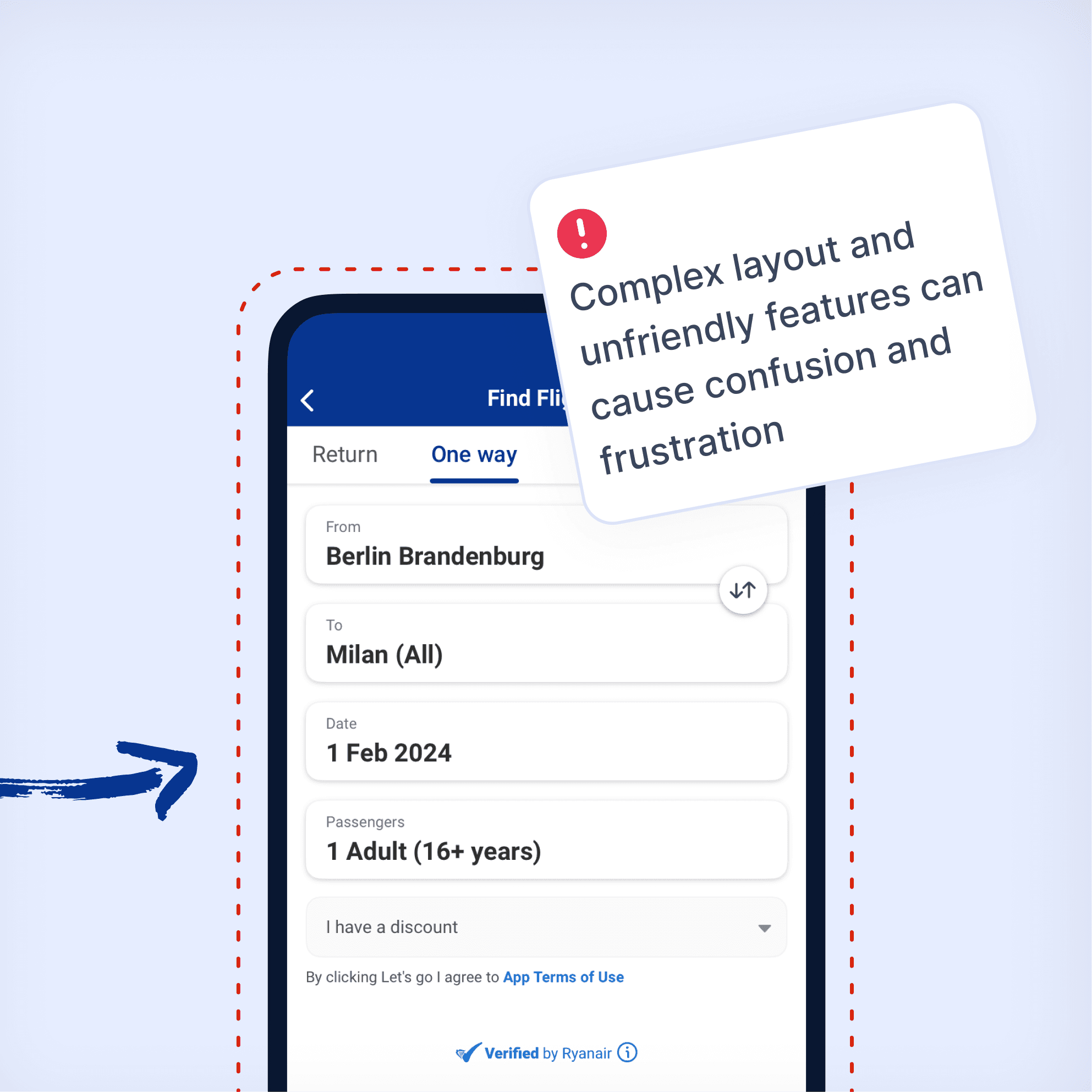
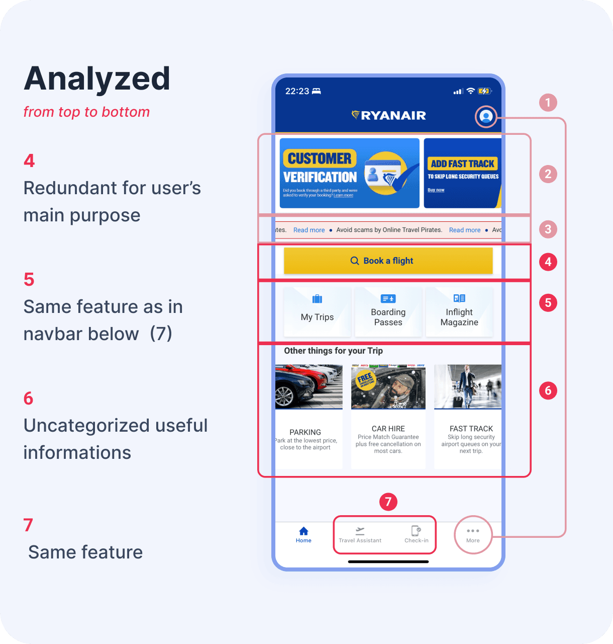
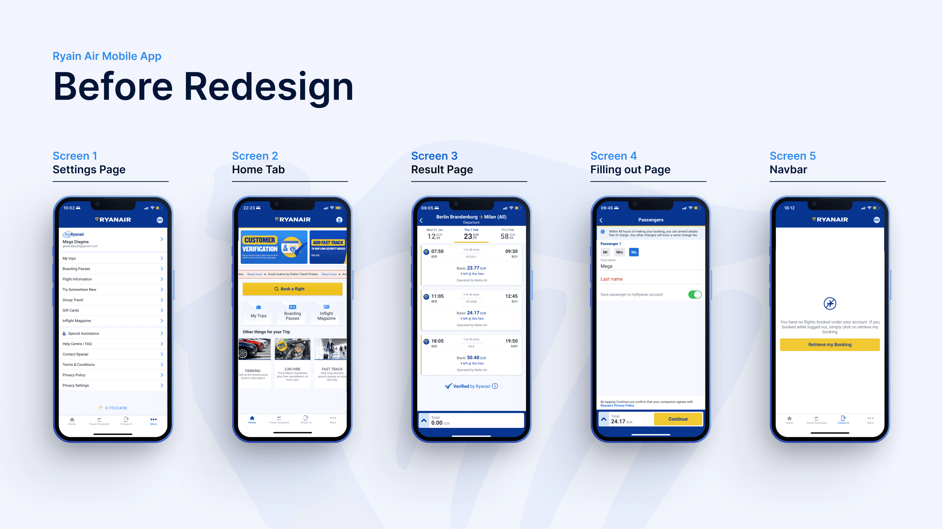
1 - Complex Information Layout
Important things are all over the place, making it tough for anyone, especially those who struggle with technology, to find what they need.
2 - Lack of User-Friendly Features
The app lacks clear hierarchy in organizing information, along with labels and easily accessible buttons. This makes it challenging for users of all abilities to navigate and use the app effectively.

challenge.
Navigating the challenge of balancing innovation and consistency in redesigns, particularly with services like those offered by Ryanair, is crucial to me. Throughout the redesign process, I prioritize maintaining a delicate balance between integrating fresh design trends and upholding brand consistency.
It's essential for me to ensure that designs remain accessible and user-friendly for all passengers, including older individuals who fly with Ryanair. In navigating these challenges, I've gained insights into holistic design approaches that resonate with my objectives and effectively serve the project's goals.
Addressing Ryanair's business needs proved challenging, given its low-budget flight model. The airline prioritizes revenue maximization and cost-effectiveness, adding complexity to the design process. This requires finding solutions that align with both user needs and business objectives.
solution.
Using heuristic analysis, I explored the Ryanair app to identify usability issues and improvement opportunities.
Through an iterative design process by validating ideas with fellow participants, I researched similar mobile apps and conducted two usability testing rounds with four participants each. From these, I gathered insights into user preferences and usability challenges.
Based on the insights gathered, I implemented several usability improvements to enhance clarity, consistency, and overall user interaction.
For more in depth discussion please visit my Medium Page

learning.
From this experience, I learned the importance of balancing innovation with consistency and addressing diverse user needs, including older passengers. It reinforced the value of user-centered design and accessibility while maintaining brand identity. Usability testing revealed a key issue with the price comparison indicator, prompting plans to add clearer labeling. As design is iterative, I remain open to ongoing improvements.

Mega Diagma
UXUI Design

