REDESIGN CHALLENGE
Ryanair Mobile App
Revamping the skies for a better accessibility


Improving Accessibility for Ryanair App
The second week of Ironhack Bootcamp was to redesign an app that has poor accessibility, and I find Ryan Air suits this topic. Expect a refreshed experience that aligns with the thrill of budget travel, now with an effortlessly accessible app.
4 Days
Mobile App
UX/UI Design
Client
Personal Project
Date
February 2024
Role
UX/UI Design
Keywords
Accessibility , Redesign App , User-friendly
At a glance
Problem
1 - Complex Information Layout
Important things are all over the place, making it tough for anyone, especially those who struggle with technology, to find what they need.
2 - Lack of User-Friendly Features
The app lacks clear hierarchy in organizing information, along with labels and easily accessible buttons. This makes it challenging for users of all abilities to navigate and use the app effectively.
Goal
Improving 5 screens of Ryan Air App, the low-cost airline that I frequently use when traveling
Outcome
High Fidelity Prototype with user testing


Cluttered information and disorganized design make it hard to find what you need.

1
1 - Double unnecessary feature
2 - Unstructured advertisement
3 - Misplaced information
4 - Redundant for user’s main purpose
5 - same feature as in navbar below (7)
6 - uncategorized useful informations
7 - Same feature
Legend:
2
3
4
5
6
7
Home Page: Unclear hierarchy or information
Example of How I identify pain points of screen
What I did
Using the tool of heuristic analysis in mind, let’s explore opportunities for improvement and envision a more user-friendly experience.
Identifying pain points of Ryan air
Setting Page looks cluttered and hard to find information
Redundant page on the Home Page for flight search and entering passenger details after flight selection.
Inefficient Comparison of Flight Options and Dates
One of the navbar has the same function but different label
Iteration and Stakeholder Feedback
The iterative process, central to design thinking, involved exploring similar mobile apps, capturing screenshots for inspiration, and addressing identified pain points across various categories, including multi-transportation and airline apps.
Through two rounds of usability testing, each involving four participants, I gathered valuable usability issues, understanding user preferences. The final enhancements I plan to incorporate include as follows:
Thicker icon and increased clicked area
Settings page can have the same pattern as other pages
The color indicating comparison price between dates were ambiguous. One can tell that it’s related to price, but can also be related to availability.
The shown dates should look like that it is horizontally scrollable
Challenge Faced
Navigating the challenge of balancing innovation and consistency in redesigns, particularly with services like those offered by Ryanair, is crucial to me. Throughout the redesign process, I prioritize maintaining a delicate balance between integrating fresh design trends and upholding brand consistency.
It's essential for me to ensure that designs remain accessible and user-friendly for all passengers, including older individuals who fly with Ryanair. In navigating these challenges, I've gained insights into holistic design approaches that resonate with my objectives and effectively serve the project's goals.
Addressing Ryanair's business needs proved challenging, given its low-budget flight model. The airline prioritizes revenue maximization and cost-effectiveness, adding complexity to the design process. This requires finding solutions that align with both user needs and business objectives.
Result and Retro
From this experience, I've learned the vital balance between innovation and consistency in design. Understanding the diverse needs of passengers, including older demographics, has been pivotal. It's taught me to approach design thoughtfully, integrating fresh trends while upholding brand identity. This process has highlighted the importance of user-centered design, ensuring accessibility for all passengers. In navigating these challenges, I've gained insights into holistic design approaches that resonate with both our team and our passengers.
During the last round of usability testing, experts critiqued the design and identified a crucial usability issue: the comparison price indicator between dates, as mentioned in point number 3 above. The critique suggested adding a label to the indicator. While I haven't determined the visualization yet, I'm confident that this is one of the solutions I can further iterate. Design is an iterative process, so there's always room for improvement.
For more in depth discussion please visit my Medium Page
Before and After 5 Pages of Ryan Air
Screen 1
Setting Page
Screen 2
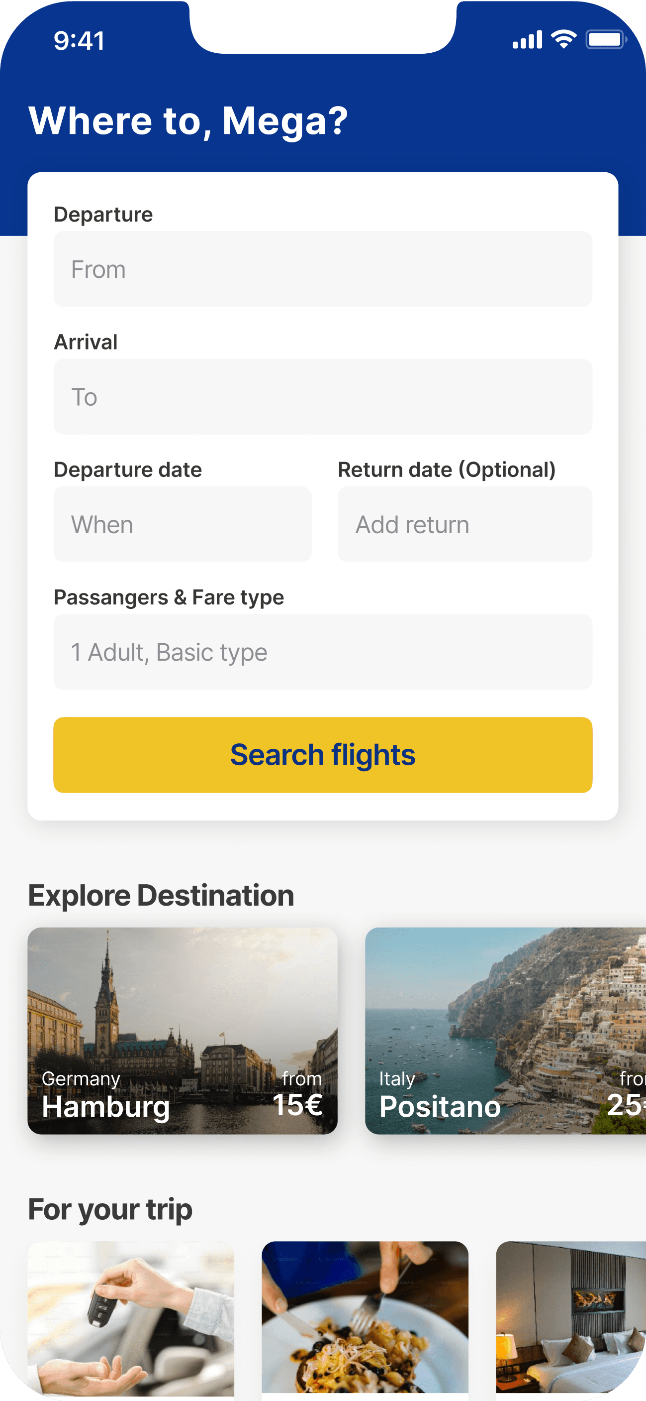
Home & Book page

Hello Mega D.
Member since May 2019
Log out
3.170.0(418)
PERSONAL
Account detail
Travel document
Companion
Wallet
Privacy Setting
COMMUNITY
Try Somewhere New
Group Travel
Companion
Gift Cards
Rate us
HELP & SUPPORT
Flight Information
Special Assistance
FAQ
Contact
Terms & Condition
Home
My Trip
My Account
9:41
Where to, Mega?
Departure
From
Arrival
To
Passangers & Fare type
1 Adult, Basic type
Departure date
When
Return date (Optional)
Add return
Search flights
Explore Destination
For your trip

Car Hire

Onboard item

Hotels

from
Germany
15€
Hamburg

from
Italy
25€
Positano

from
Germany
10€
Berlin
Explore more ->
Home
My Trip
My Account
9:41
Before
Before
After
After
Before
Sun
23
Your flight
BER -> BGY
1 hr 40 mins
Wed, 23 Jun 24 | 11:05 - 12:45
FR 3390
Basic
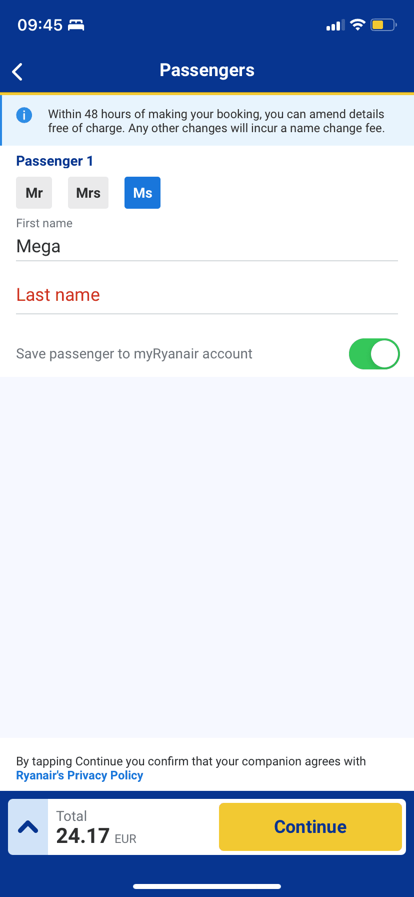
9:41
BER -> BGY
Passanger detail
First name
Last name
Save passenger to myRyanair account
Mr
Mrs
Ms
Seat Reservation
+8.00 EUR
Select bags
Bag option explained
Chose your cabin bag
Pay now
After

Before
My trip
Upcoming
Archived
Retrieve Booking
You have no upcoming journeys
retrieve a book in case you purchased a ticket as a guest user.
9:41
Home
My Trip
My Account
After
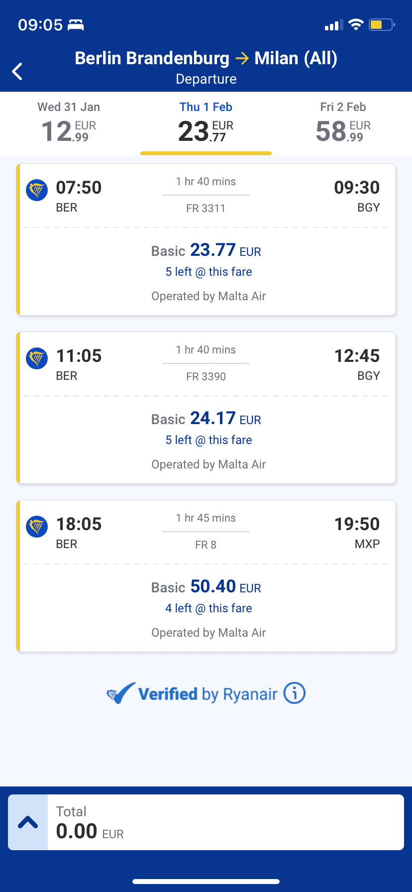
Screen 3
Result page
Screen 4
filling out page
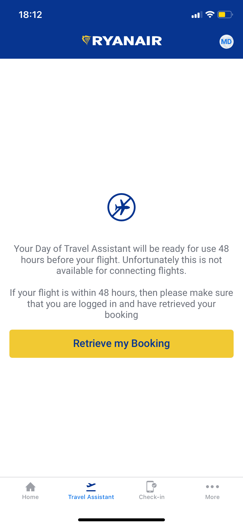
Screen 5
Navbar
Before
Sun
23
1 Passanger • Basic
23. January 2024
9:41
Berlin Brandenburg -> Milan (All)
FR 3311
23.77 EUR
07:50
BER
09:30
BGY
1 hr 40 mins
Basic
FR 3390
24.77 EUR
11:05
BER
12:45
BGY
1 hr 40 mins
Basic
FR 8
50.40 EUR
18:05
BER
19:50
BGY
1 hr 40 mins
Basic
Sat
19
Sun
20
Mon
21
Tue
22
Wed
23
Thu
24
Fri
25
Sat
26
Sun
27
Mon
28
After
New Redesign Ryan Air App pages

Other Projects
You might want to check this out too!

Anytipp Mobile App
BACHELOR THESIS PROJECT
supports peers on selling their unused luggage space to people around the world
Anytipp: Sell your unused luggage space when flying
reliable platform that surpasses the limitations of social media, focusing on selling unused luggage space while flying
3 Months
Mobile App
UX/UI Design
View project
Macbook Pro
The Earning Dashboard with High-Predictive Income
Tailoring Nightly Prices to Meet Host-Specific Needs
Maximizing Hosts' Income through Pricing Strategies
Airbnb hosts can now optimize their earnings by adjusting to their flexible scheduling needs for hosting throughout the year
2 Weeks
Dashboard
UX/UI Design
View project

Any other interesting ideas to work on? Let’s talk!
If you have any interesting ideas or projects you'd like to collaborate on, feel free to reach out to me. I look forward to hearing from you!
2025 All right reserved